So Qlikview recently ran a ‘Take Action Open Data Challenge’, basically use Qlikview on public data to uncover unexpected insights to positively change the world.
The 1st Place winner was ‘Do you Realize’ created by Alexandre Perrot, and Software Advice wrote a post on how he goes about developing dashboards.
The first point is to Think about the data. This is a great reminder, thinking through a problem can often times save you a lot of time later.
The author recommends a snow flake schema, this is pretty typical Qlikview recommendation.
He then next thinks about what the user is going to click and interact with. He started out with an overview screen.
This qlikview is very much an example of information storytelling, something Donald Farmer would no doubt approve of.
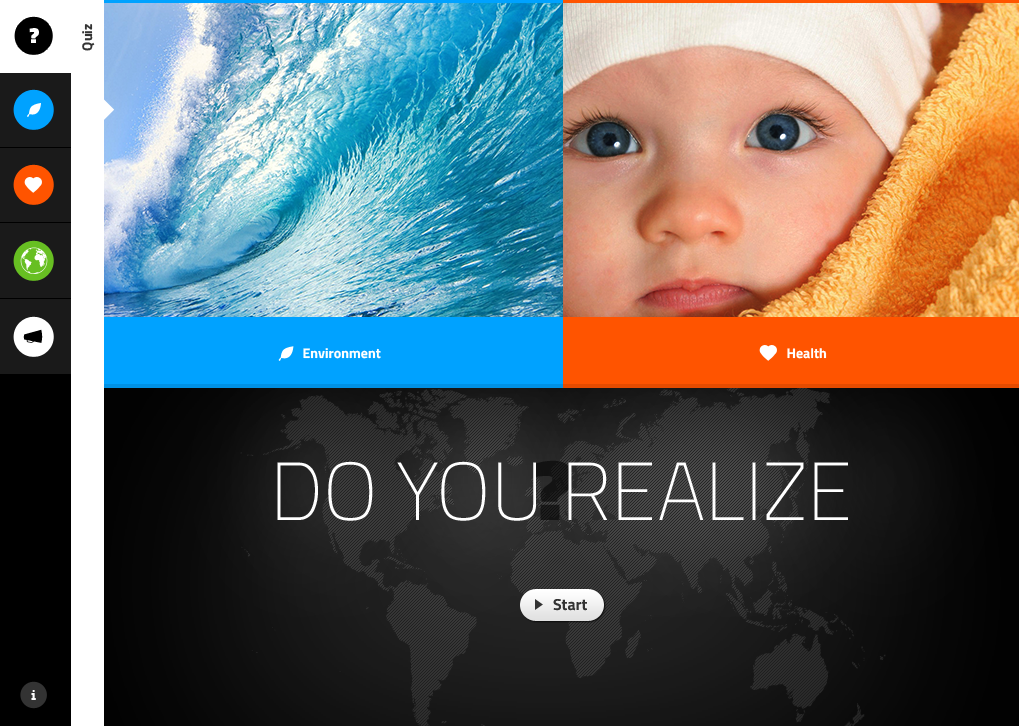
Clicking on Start tests your knowledge of what potentially will occur as far as population growth and environmental changes. It scores you as you move through it. Clicking on the leaf or the heart on the side takes you to the Environment or Health pages. Clicking on the word ‘environment’ or ‘health’ takes you no where, I would assume those button-like objects would take you there as well. Slightly annoying.
As you move through the quiz you are given the opportunity to learn more, which will take you to the salient detail screen… continuing your knowledge foraging. I did wish that I could click back to where I was in the quiz instead of having to restart each time though.
After the Overview screen he advises to create screens that help a user understand a given KPI.
He advises using color to convey change. I agree completely… but in this case I think too much color and too much chart junk is used. http://www.perceptualedge.com/articles/visual_business_intelligence/rules_for_using_color.pdf
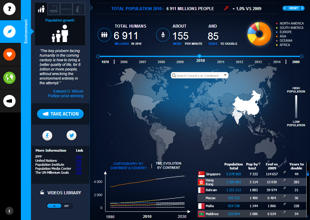
I find the use of color a little overwhelming. I would remove the ‘blue haze’ behind the map. I do like the map it is very visually appealing. I’m not a big fan of the pie chart, neither do I like bubbly iphone’ish pie charts.
Overall I agree with the points laid out by the post. I would recommend a simpler approach, but that just my 2 cents.
