There are a lot of concepts with Qlikview that can be baffling at first. I really miss being able to purchase a Qlikview ‘Bible’ (and am surprised no one has written one yet). This means you have to learn things by trial and error.
So I’m going to ruminate and exfoliate and some things I have come across. Maybe others will be able to help clarify my thinking about ‘why’ some things happen.
[SalesPeople]:
LOAD * INLINE [
Name, Area
Raymond, North
Drew, North
Jakeem, South
Stewart, South
Murphy, West
Sam, West
John, East
];
First, let’s make a simple chart. Let’s show the names of the Sales Person and what area they are associated with.
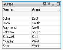
That’s fairly easy, create a straight chart, add Name as the Dimension, and Area as the expression.

You will notice the nice dash at the top, this is because it is trying to total the rows. So open up the Expressions tab and click No Totals in the Total Mode. And the dash will go away.
Ok, the challenge, reverse the display of the data. Show the areas that the Sales Person is associated with. Like this (once again straight chart, pivots are a whole different animal)
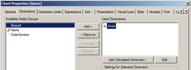
Now of course your initial thought is probably to set Area as your dimension, and Name as your expression. Like
And
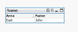
But if you do that you will end up with
Now that’s pretty strange isn’t it 🙂


Usually when you want to use a chart object (straight table, pivot table, etc), you usually want your expression to use a function. That’s not absolute, but if you aren’t using a function, the question you have to ask yourself is “why?” What are you trying to display?
Based on your example here I would use a Table object. Not a chart. If you do want to use a chart, I would put both fields as a dimension and then put an expression like =count(Area) or =count(Name)
One way to think about it is that a chart object – no matter what it is, wants to aggregate. Even though you can write an expression that does not aggregate, really the charts power is with aggregation.
When you try to use fields that cannot be aggregated, like text fields, the chart will do things that don’t make sense.
So, don’t worry so much about the fact that weird things happen, think about what you are trying to display. Can you do it with an aggregation? If you can, use a chart. Does it not require an aggregation? Then use the Table object (not the chart). Don’t let the terms “Straight Table” and “Pivot Table” confuse you.
Maybe this helps?
Hi Ralph,
that’s how it goes in multi dimensional BI, not only in QlikView. You need to aggregate over dimensions. In this case you can use aggregation function CONCAT. QlikView shows only a value without aggregation function if it’s the only single one.
– Ralf