So I have been working on setting up some scorecarding and dashboarding Qlikviews for display on iphone/ipads. One design tip: design it to be readable on an iphone and it will look perfect on an iPad.
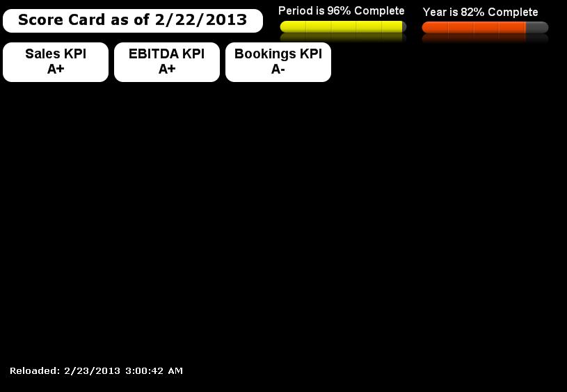
So for lack of a better name I call the top of our “BI” pyramid the scorecard. This is simply a rolled up grade of some metrics.
It looks like this:
If something concerns you (or you want to know more, you simply press say the Bookings KPI) and that will open up the Bookings KPI Dashboard. I did this with an ‘Open URL’ Action and the use the
‘AJAX’ link to the qlikview http://qlikview.nffc.local/QvAJAXZfc/opendoc.htm?document=Sales/BookingsKPI/BookingsKPI.qvw&host=QVS@qlikview
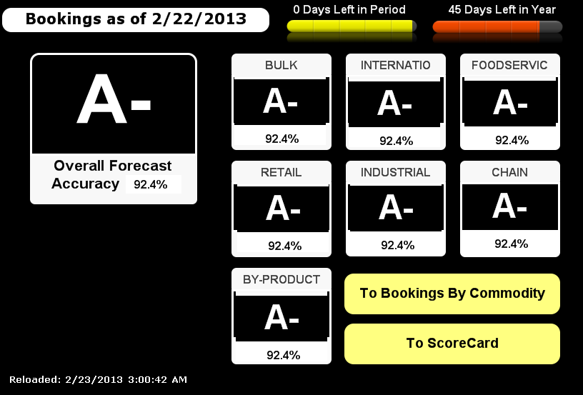
Now, if you want even more specific information you can drill down by pressing the ‘To Bookings By Commodity”
This opens up the Bookings Commodity Dashboard
It looks like this
Notice buttons down the right (better ipad/iphone UI)
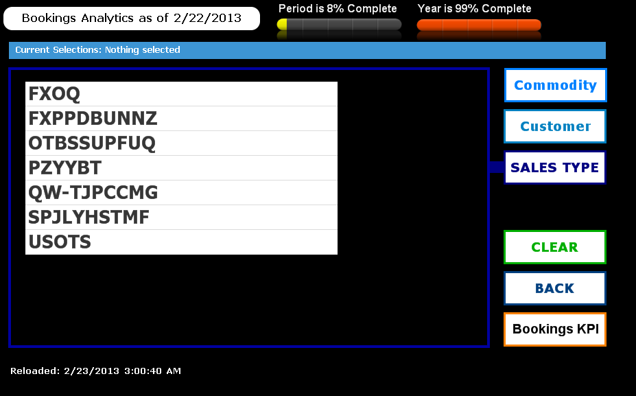


I use list boxes because this allows for single click (instead of click and hold which I find an annoying interface most the time) for charts I will overlay a listbox to accomplish this.
